SESH
Elevating the Cannabis Experience
Sesh is a lifestyle brand that designs portable storage solutions for daily cannabis consumers. Founded by conscious consumers and avid travelers Dawn and Treg Bradley, Sesh combines stylish design with practical functionality, offering solutions for enjoying and storing cannabis both at home and on the go. Partnering with Noise 13, they set out to develop a brand strategy and brand system that elevates the cannabis lifestyle, aiming to position Sesh as a respectable, innovative, and fashion-forward brand that balances quality, style, and utility.
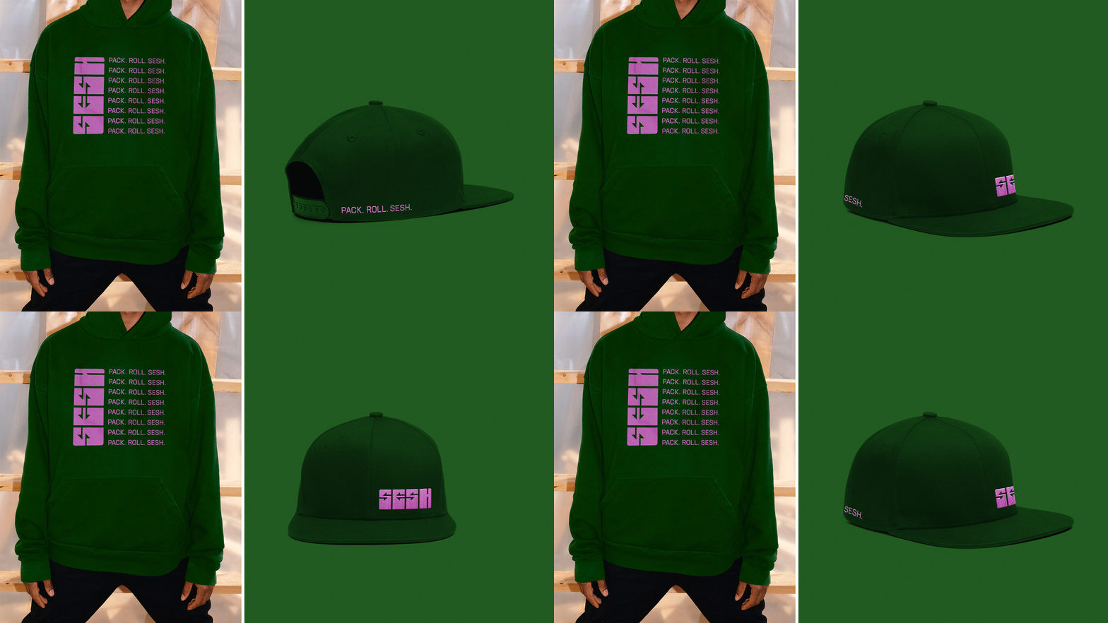
One of Sesh's key products is the Sesh Case—a sleek, colorful container inspired by Bento-style lunchboxes that keeps your stash fresh and organized. We drew design inspiration from this modular product, using its rearrangeable elements as a reference for the logotype. The custom arrows within the letters' counter space mirror the brand’s adaptable, on-the-go nature. The identity is further brought to life through punchy, bud-inspired colors, lifestyle photography, and a graphic logo application that reflects the brand’s striking, stylish personality.
We crafted a brand that reimagines cannabis storage, elevating everyday rituals with a design that’s both purposeful and fashion-forward. It’s a clear departure from the plastic baggies and cheap canisters of the past, signaling a new standard for the modern cannabis lifestyle.
For a detailed look at the website design process, including the sitemap and final handoff file to the development team, please refer to this Figma file.
PROJECT
Brand System
Packaging
Print & Collateral
Digital & Web
Marketing
Photography
Illustration
Messaging
Strategy
TEAM
Agency: Noise 13
CCO: Dava Guthmiller
Creative Director: Peter Judd
Designers: Elaine Chaw & Zili Ma
Copywriter: Kyle Showen


